Contain Yourself
Keep Images in their Containers with max-width
Section titled “Keep Images in their Containers with max-width”Responsive images aren’t just about loading the right pixels — they’re also about making sure those pixels don’t punch a hole through your layout.
This lesson focuses on image containment: the pattern that keeps big, beautiful images from overflowing their container on narrow viewports.
🤯 The problem: uncontained images
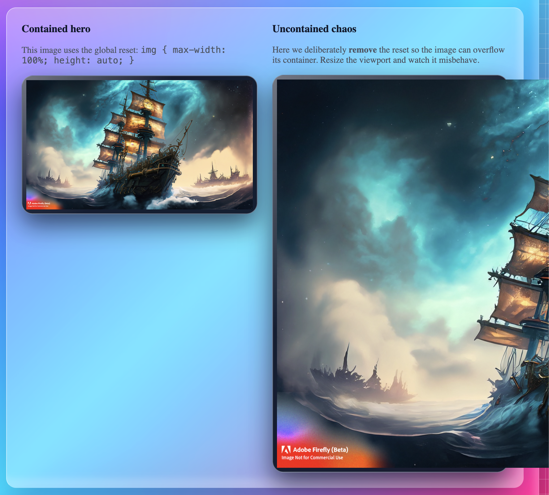
Section titled “🤯 The problem: uncontained images”By default, an <img> element renders at its intrinsic size.
If you drop a 1792px-wide hero image into a layout that’s only 360px wide, the
image will happily overflow and force horizontal scrolling.
That’s what the first version of our demo shows:
- a huge steampunk ship hero image
- no max-width rule
- the image overflows its container on small screens
🛡 The fix: max-width: 100% + height: auto
Section titled “🛡 The fix: max-width: 100% + height: auto”The classic containment pattern is tiny but powerful:
img { max-width: 100%; height: auto; display: block;}What this does:
max-width: 100%→ never let the image grow wider than its containerheight: auto→ keep the aspect ratio correct while scaling downdisplay: block→ removes inline whitespace and plays nicer in most layouts
Drop this into your shared stylesheet and every image will:
- shrink gracefully on small screens
- respect its container
- stay sharp on larger breakpoints (as long as the source image is large enough)
👀 See containment in action
Section titled “👀 See containment in action”In the demo, we use a single large hero image of a steampunk airship in a storm.
Once you’ve wired up your assets, you can drop examples like this into your content:
| State | Notes |
|---|---|
| Uncontained | The image renders at its full intrinsic width and blows past the card. |
| Contained | max-width: 100% keeps the image neatly inside the main content column. |
💡 In DevTools, toggle the
img { max-width: 100%; height: auto; }rule on and off to show students the difference in real time.
You can generate these screenshots directly from your contain-yourself demo page
and save them as:
🧩 How this fits into the bigger picture
Section titled “🧩 How this fits into the bigger picture”This pattern doesn’t handle which image is loaded — that’s the job of:
<img srcset>andsizes(resolution switching)<picture>(art direction)image-set()in CSS (backgrounds)
Instead, Contain Yourself is all about layout sanity:
First, make sure images can’t wreck your page.
Then, optimize which pixels you send.
Once you’ve locked in image containment, you’re ready for Right Pixels, Right Place and Picture Rolling Action!.