Direction & Axes
Know thine axes
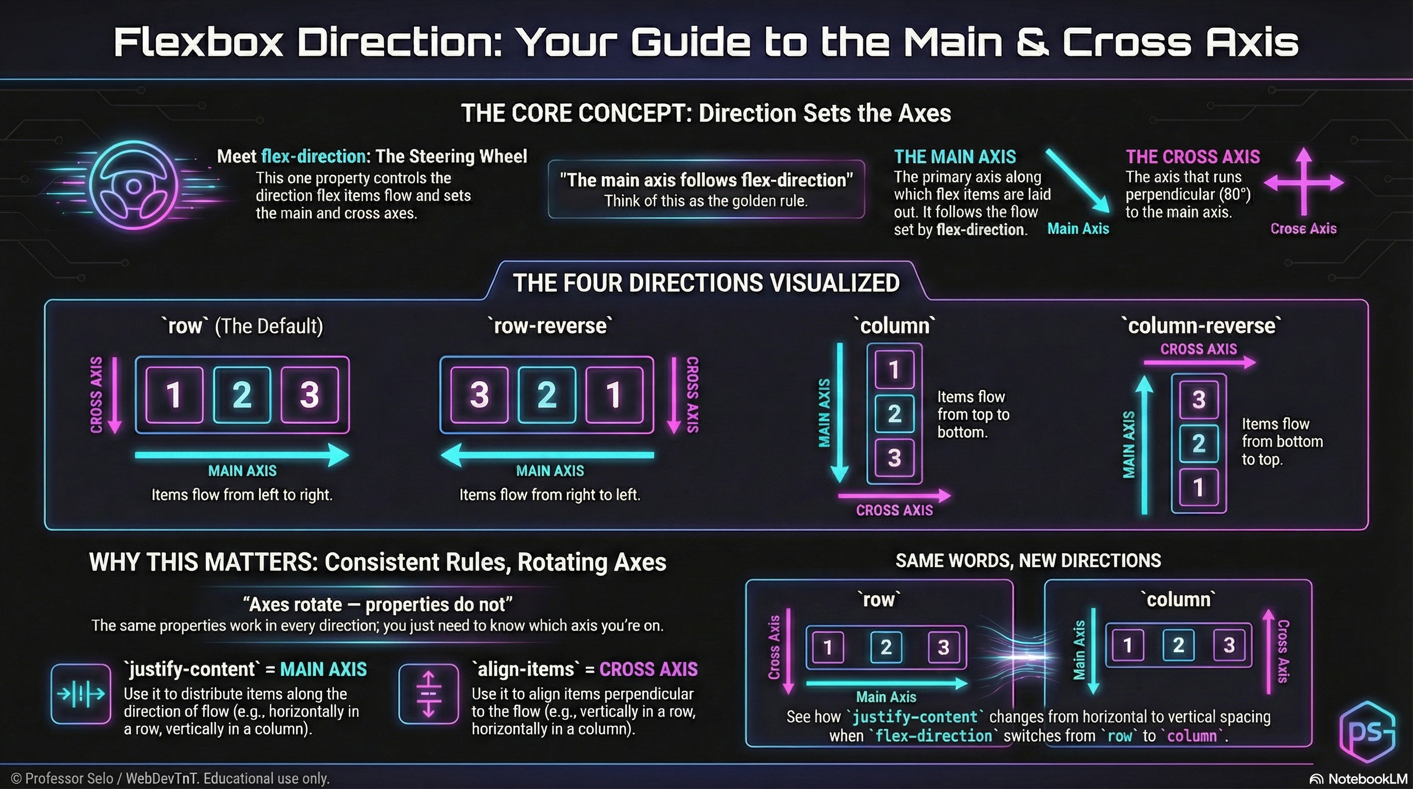
Section titled “Know thine axes”Flexbox doesn’t think in horizontal and vertical — it thinks in main axis and cross axis.
And the single property that defines both is flex-direction.
flex-direction Sets the Axes
Section titled “flex-direction Sets the Axes”flex-direction: row;flex-direction: row-reverse;flex-direction: column;flex-direction: column-reverse;Direction determines:
- how flex items flow
- where the main axis runs
- where the cross axis runs
- how alignment, spacing, and wrapping will behave
Direction is the steering wheel.
Axes are the roads.
The Main Axis
Section titled “The Main Axis”The main axis is always the direction items move.
row→ left → rightrow-reverse→ right → leftcolumn→ top → bottomcolumn-reverse→ bottom → top
Anything that distributes items along the line (like justify-content) works on the main axis.
The Cross Axis
Section titled “The Cross Axis”The cross axis is always perpendicular to the main axis.
- Row modes → cross axis is vertical
- Column modes → cross axis is horizontal
Anything that aligns items across the line (like align-items) works on the cross axis.
The Four Modes
Section titled “The Four Modes”/* Inline direction */flex-direction: row; /* main: left→right */flex-direction: row-reverse; /* main: right→left */
/* Block direction */flex-direction: column; /* main: top→bottom */flex-direction: column-reverse; /* main: bottom→top */The MiniMo above lets us flip through each mode and watch the axes rotate in real time.
Why This Matters
Section titled “Why This Matters”Every flexbox power move depends on knowing the axes:
- justify = main axis
- align = cross axis
- grow/shrink/basis size items along the main axis
- wrapping flows along the main axis
Now that our map is clear, we can place items with precision.
Extra Bits & Bytes
Section titled “Extra Bits & Bytes”📘 Direction and Axes Study Guide (PDF)
📘 Direction and Axes Infographic (PNG)
⏭ Next in line: Justify & Align
Section titled “⏭ Next in line: Justify & Align”The choreography of the axes.