Wrap & Flow
Lines That Bend, Not Break
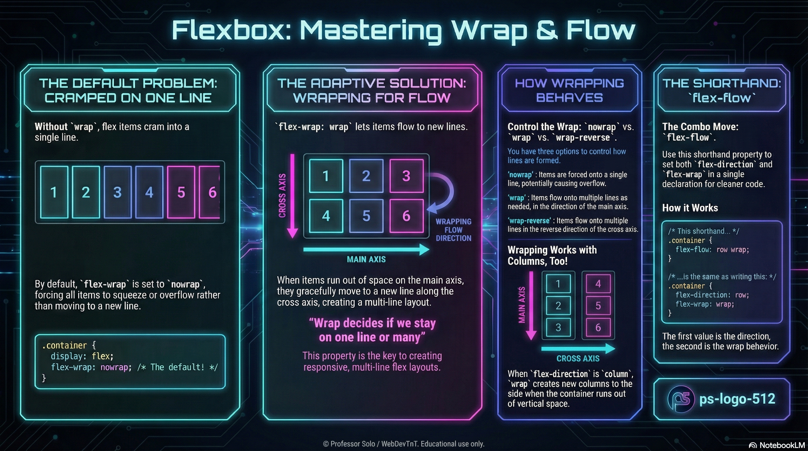
Section titled “Lines That Bend, Not Break”Flexbox is happiest when layouts adapt, not explode.
Wrapping lets items flow onto new lines instead of forcing scrollbars, overlap, or microscopic text.
flex-wrap controls whether we stay on a single line or spill gracefully.
flex-flow bundles direction and wrap into one neat shorthand.
flex-wrap: One Line or Many
Section titled “flex-wrap: One Line or Many”By default, flex containers try to keep everything on one line:
.gallery { display: flex; flex-wrap: nowrap; /* default */}The options:
flex-wrap: nowrap; /* stay on one line; items squeeze */flex-wrap: wrap; /* allow new lines in the cross-axis direction */flex-wrap: wrap-reverse; /* new lines stack from the opposite side */- In a row, wrapping creates new rows below (or above with
wrap-reverse). - In a column, wrapping creates new columns beside the original line.
Wrap is the difference between “crammed” and “comfortable.”
flex-flow: Direction + Wrap in One
Section titled “flex-flow: Direction + Wrap in One”We already know flex-direction picks the main axis.
flex-flow simply pairs that with flex-wrap:
/* flex-flow: <flex-direction> <flex-wrap>; */
.gallery {  display: flex;  flex-flow: row wrap;}
/* equivalent to */.gallery {  display: flex;  flex-direction: row;  flex-wrap: wrap;}
This is the combo move we reach for in real projects:
row wrapfor responsive rows of cards.column wrapfor multi-column vertical stacks.
How Wrap Interacts With Grow, Shrink, Basis
Section titled “How Wrap Interacts With Grow, Shrink, Basis”Wrapping does not replace grow/shrink/basis — it works with them.
flex-growstill decides who takes extra space on each line.flex-shrinkstill decides who yields when a line gets tight.flex-basisstill sets the starting size along the main axis.
Wrap simply decides:
“Do we fight to stay on this line, or do we start a new one?”
Mental Model to Keep
Section titled “Mental Model to Keep”- Direction sets the main axis.
- Wrap decides whether there is only one line or many.
- Grow/shrink/basis negotiate space within each line.
Extra Bits & Bytes
Section titled “Extra Bits & Bytes”📘 Wrap and Flow - Study Guide (PDF)
📘 Wrap and Flow - Infographic (PNG)
⏭ Overflowing: Multi-Line Alignment
Section titled “⏭ Overflowing: Multi-Line Alignment”When flex items wrap, a whole new set of alignment rules quietly takes over.