Mind the Gap
Space without hacks.
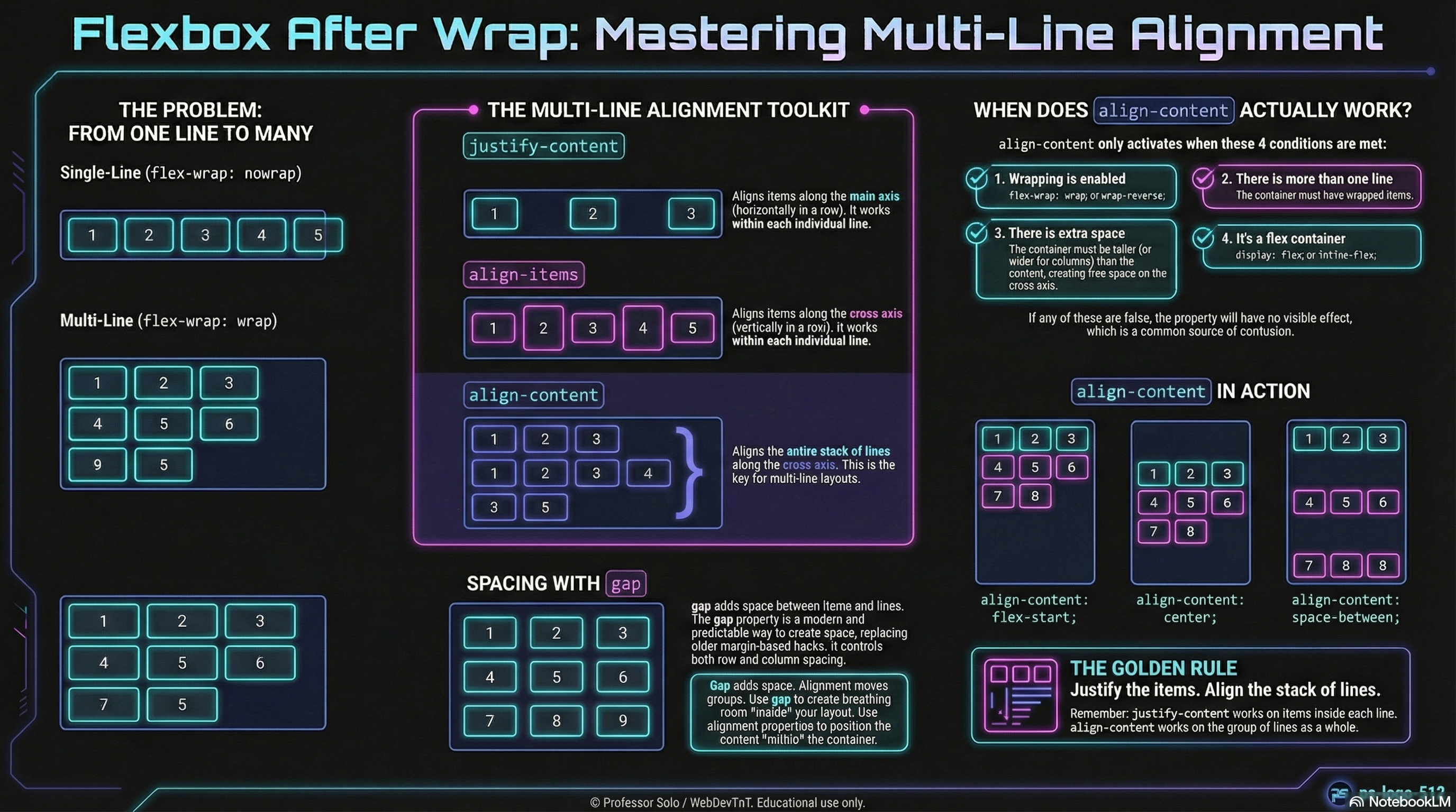
Section titled “Space without hacks.”Flexbox spent years paired with awkward margin tricks:
negative offsets, doubled edges, mysterious extra space.
Modern layout gives us a cleaner option:
gap– shared spacing between items on both axesrow-gap– spacing between rowscolumn-gap– spacing between columns
No extra wrappers. No weird first/last-child rules. Just honest, structural space.
gap: Built-In Spacing Between Items
Section titled “gap: Built-In Spacing Between Items”On a flex or grid container, gap defines the space between items:
.gallery { display: flex; flex-wrap: wrap; gap: 1rem;}Key details:
- Gap does not add space at the outer edges of the container.
- Gap only appears between siblings.
- Gap respects wrapping automatically.
This alone replaces a surprising number of margin-based spacing systems.
row-gap & column-gap
Section titled “row-gap & column-gap”For finer control, row-gap and column-gap target each axis separately:
.gallery { display: flex; flex-wrap: wrap; row-gap: 1.5rem; /* between rows (cross axis for a row layout) */ column-gap: 0.75rem; /* between columns (main axis for a row layout) */}Remember the axes:
-
In a row container:
column-gap→ along the main axis (left/right)row-gap→ along the cross axis (top/bottom)
-
In a column container:
column-gap→ along the cross axis (left/right)row-gap→ along the main axis (top/bottom)
The names stay the same, even when the axes rotate.
Gap vs Margin in a Nutshell
Section titled “Gap vs Margin in a Nutshell”Margin-based spacing:
- pushes against neighbors and the container edge
- often needs special rules for the first/last item
- can stack in unexpected ways
Gap-based spacing:
- only exists between items
- keeps container edges clean
- follows the flex or grid algorithm instead of fighting it
Margins still have a job for components and page edges.
Gap shines as the spacing system inside a flex or grid layout.
Extra Bits & Bytes
Section titled “Extra Bits & Bytes”📘 Multi-Line Alignment, Gaps Included - Study Guide (PDF)
📘 Multi-Line Alignment, Gaps Included - Infographic (PNG)
⏭ Step Right Up: The Remix
Section titled “⏭ Step Right Up: The Remix”With gap in the toolkit:
- Flex rows and wrapped sets become easier to read and maintain.
- Grid layouts share the same mental model for internal spacing.
- The Flexbox Codex can offer “drop-in spacing recipes” that rely on gap instead of hacks.
Next, we explore how reordering can change what appears where —
even when the source order in the HTML stays the same.