Reordering Reality
When Visual Order Lies
Section titled “When Visual Order Lies”Flexbox lets us bend what appears where without touching the HTML.
That power runs through a single property: order.
Used with intention, order can:
- Pull a feature card to the front on larger screens
- Tuck secondary content toward the end of a row or column
Used carelessly, it breaks expectations, accessibility, and reading flow.
The Basics: order on Flex Items
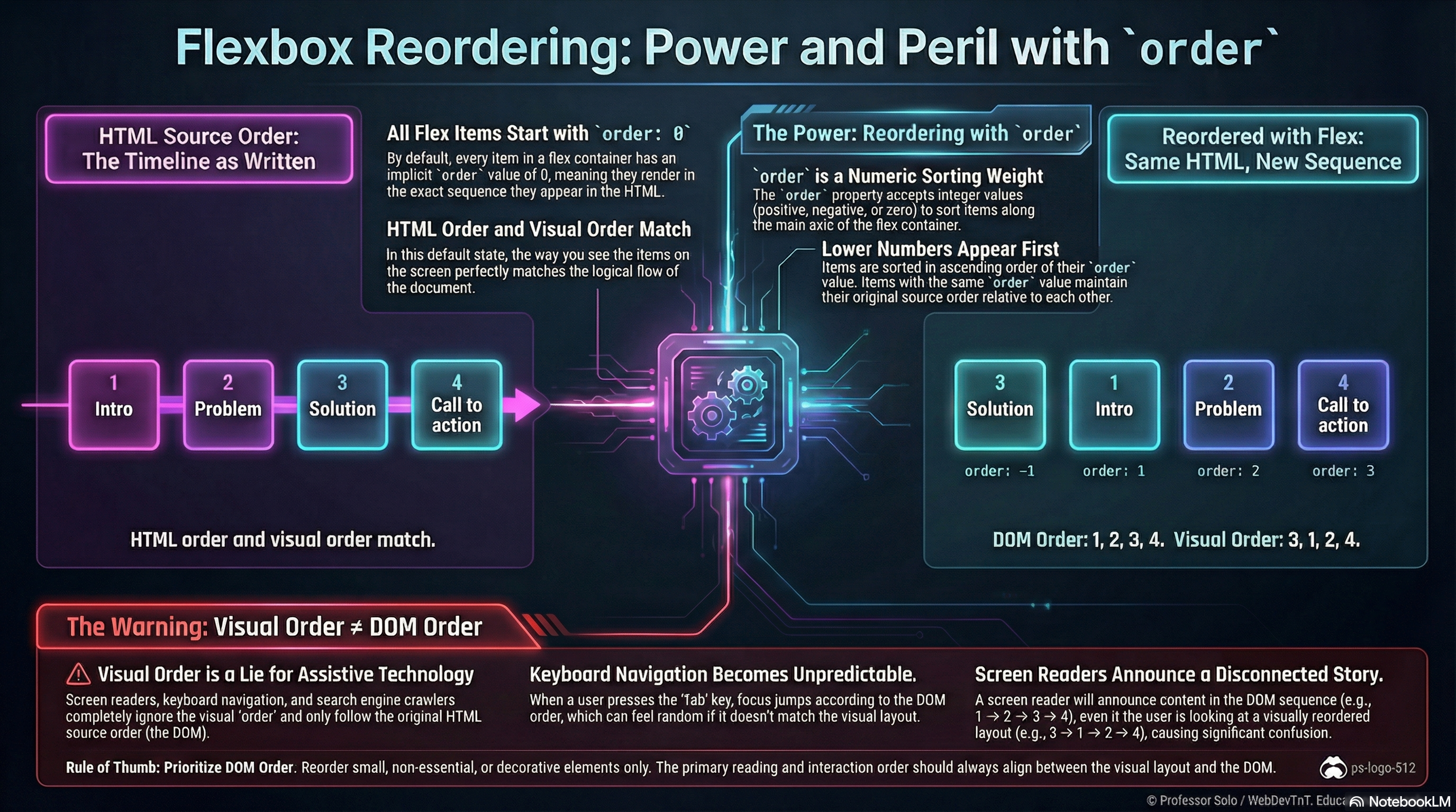
Section titled “The Basics: order on Flex Items”Every flex item has an implicit order: 0.
Items are rendered in source order, then sorted by order:
.line > .card--hero {  order: -1; /* appears before items with order: 0 */}
.line > .card--footer {  order: 10; /* appears after default items */}
Sorting rules:
- Items with lower order appear first.
- Items with the same order keep their original source order.
- Negative values are allowed; we often use
-1for “pull forward.”
The DOM stays the same; only the visual sequence along the main axis changes.
Common Patterns (Used Sparingly)
Section titled “Common Patterns (Used Sparingly)”A few scenarios where order can help:
- Promoting a hero card in a row of content on larger screens
- Shifting supporting pieces (like ads or secondary panels) toward the end
- Altering layout between breakpoints without duplicating markup
Example:
/* Mobile: natural reading order */.cards > article {  order: 0;}
/* Desktop: hero first, supporting cards after */@media (min-width: 768px) {  .cards > .card--hero {    order: -1;  }}
The MiniMo demonstrates exactly this:
same HTML, different visual order depending on the chosen mode.
Serious Warnings: Source Order Still Rules
Section titled “Serious Warnings: Source Order Still Rules”Even when flexbox redraws the stage, source order remains reality for:
- Screen readers
- Keyboard navigation
- Copy/paste and text scraping
- SEO and document structure
If the visual order and source order drift too far apart:
- Focus jumps feel “random” when tabbing.
- Screen readers announce content in a different order than we see.
- Students (and future maintainers) get confused by layouts that contradict the DOM.
Rule of thumb:
Reorder small, decorative pieces if we must.
Keep primary reading order aligned between DOM and visual layout.
Mental Model to Keep
Section titled “Mental Model to Keep”- The DOM defines the true order.
orderonly adjusts the presentation along the main axis.- We prefer to design layouts that do not rely heavily on reordering.
Extra Bits & Bytes
Section titled “Extra Bits & Bytes”📘 Reordering, Responsibly - Study Guide (PDF)
📘 Reordering, Responsibly - Infographic (PNG)
⏭ Take the Wheel, Check the Codex
Section titled “⏭ Take the Wheel, Check the Codex”Time for you to exercise you new skills with some challenges.
Then, in the Flexbox Codex, you’ll find a few handy flex recipes.