Flexbox Codex
Snippets To Go
Section titled “Snippets To Go”Your pocket arsenal of repeatable, reliable, boss‑level flex recipes.
This page is not a tutorial.
It is a move list — the CSS you reach for when you already understand the concepts and just need the pattern.
Each recipe is:
- minimal
- predictable
- breakpoint‑friendly
- aligned with everything from the Flexbox Trials
01 — Perfect Row
Section titled “01 — Perfect Row”.row { display: flex; gap: 1rem; align-items: center; /* cross-axis */}Use when:
You want items in a line, evenly spaced, aligned vertically.
02 — Perfect Column
Section titled “02 — Perfect Column”.col { display: flex; flex-direction: column; gap: 1rem;}Use when:
You want readable vertical stacks without margin hacks.
03 — Center Everything (The Old Nemesis)
Section titled “03 — Center Everything (The Old Nemesis)”.center-all { display: flex; justify-content: center; align-items: center;}Use when:
You want the mythical “dead-center” layout.
04 — Push Left / Push Right
Section titled “04 — Push Left / Push Right”.push-right { margin-left: auto;}
.push-left { margin-right: auto;}Use when:
You need one item to drift to the far edge.
05 — Space Between (Classic Header)
Section titled “05 — Space Between (Classic Header)”.header { display: flex; justify-content: space-between; align-items: center;}Use when:
You need left + right anchors with breathing room.
06 — Responsive Row → Column
Section titled “06 — Responsive Row → Column”.feature { display: flex; flex-direction: column; gap: 1rem;}
@media (min-width: 720px) { .feature { flex-direction: row; }}Use when:
You want mobile‑first stacking and desktop side‑by‑side.
07 — Wrap & Gap Gallery
Section titled “07 — Wrap & Gap Gallery”.gallery { display: flex; flex-wrap: wrap; gap: 1rem;}
.gallery > * { flex: 1 1 220px; /* flexible width with lower bound */}Use when:
You want a responsive card grid without grid.
08 — Centered Column with Max Width
Section titled “08 — Centered Column with Max Width”.stack { display: flex; flex-direction: column; gap: 1rem; max-width: 60ch; margin-inline: auto;}Use when:
You need readable text sections that scale well.
09 — Hero First (Use Carefully)
Section titled “09 — Hero First (Use Carefully)”.hero { order: -1;}Use when:
You want the hero visually first without moving it in the DOM.
Warning:
Screen readers still read it in DOM order.
10 — Stubborn Fixed‑Size Item
Section titled “10 — Stubborn Fixed‑Size Item”.fixed { flex: 0 0 10rem; /* no grow, no shrink, fixed basis */}Use when:
You need an item immune to stretching or squishing.
11 — Greedy Grower
Section titled “11 — Greedy Grower”.grow-3 { flex-grow: 3;}Use when:
One item should dominate extra space.
12 — Anti‑Shrink Sentinel
Section titled “12 — Anti‑Shrink Sentinel”.no-shrink { flex-shrink: 0;}Use when:
You do NOT want it squeezed smaller.
13 — “Respect My Height” Column Child
Section titled “13 — “Respect My Height” Column Child”.col > .tall { align-self: stretch;}Use when:
You want one child to grow full cross-axis height.
14 — Reverse Row
Section titled “14 — Reverse Row”.reverse { flex-direction: row-reverse;}Use when:
You need the far-end item to appear first visually.
15 — Holy Alignment Trinity
Section titled “15 — Holy Alignment Trinity”.align-pack { display: flex; justify-content: center; /* main */ align-items: center; /* cross */ gap: 1rem;}Use when:
You need symmetry without guessing which axis is which.
16 — Sidebar / Main / Extras
Section titled “16 — Sidebar / Main / Extras”.layout { display: flex; gap: 1rem;}
.layout__side { flex: 0 0 12rem;}.layout__main { flex: 1 1 auto;}.layout__extra { flex: 0 0 10rem;}Use when:
You want a responsive tri‑panel layout that adapts gracefully.
17 — “Fit in Columns” Trick
Section titled “17 — “Fit in Columns” Trick”.list { display: flex; flex-wrap: wrap; gap: 0.5rem;}
.list > li { flex: 1 1 12ch;}Use when:
You want list items to form tidy vertical columns at any width.
18 — Balanced Button Set
Section titled “18 — Balanced Button Set”.actions { display: flex; gap: 0.5rem;}
.actions > * { flex: 1 1 0;}Use when:
You want equal‑width buttons without math.
19 — Align One Oddball
Section titled “19 — Align One Oddball”.oddball { align-self: flex-end;}Use when:
One item should break the cross-axis pattern intentionally.
20 — Centered Footer Links
Section titled “20 — Centered Footer Links”.footer-links { display: flex; flex-wrap: wrap; gap: 0.75rem; justify-content: center;}Use when:
You want clean, centered clusters with good wrapping behavior.
21 — Media Object (Classic Pattern)
Section titled “21 — Media Object (Classic Pattern)”.media { display: flex; gap: 1rem;}
.media__img { flex: 0 0 auto;}.media__body { flex: 1 1 auto;}Use when:
You want an image + content layout that never collapses.
22 — Evenly Spaced Toolbar
Section titled “22 — Evenly Spaced Toolbar”.toolbar { display: flex; justify-content: space-evenly; align-items: center;}Use when:
Buttons or icons should spread evenly across the row.
23 — Wrap‑Aware “Tag Cloud”
Section titled “23 — Wrap‑Aware “Tag Cloud””.tags { display: flex; flex-wrap: wrap; gap: 0.5rem;}
.tags > span { flex: 0 0 auto;}Use when:
Tags should wrap naturally but keep intrinsic width.
24 — Full‑Bleed Hero with Centered Content
Section titled “24 — Full‑Bleed Hero with Centered Content”.hero { display: flex; flex-direction: column; justify-content: center; /* vertical centering */ align-items: center; /* horizontal centering */ min-height: 60vh;}Use when:
You want dramatic center‑stage content.
25 — Mobile Header with Burger Right
Section titled “25 — Mobile Header with Burger Right”.header { display: flex; align-items: center; gap: 1rem;}
.burger { margin-left: auto;}Use when:
Left logo → right menu button, clean and simple.
Extra Bits & Bytes
Section titled “Extra Bits & Bytes”📘 Flexbox Codex - Study Guide (PDF)
📘 Flexbox Codex - Infographic (PNG)
Last Call
Section titled “Last Call”The Codex isn’t the whole story — just the moves you reach for fastest.
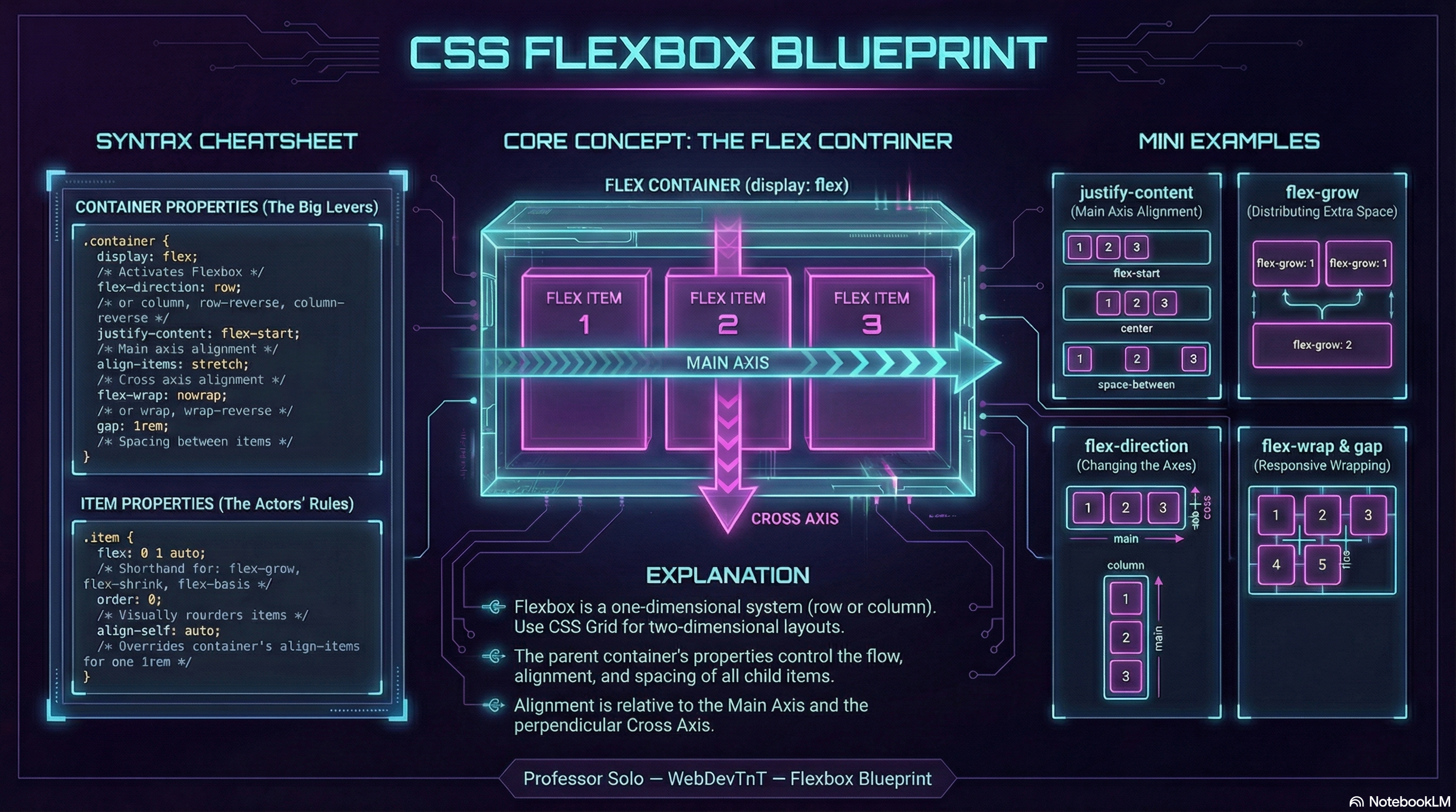
If in doubt, remember:
- direction defines the line
- wrap defines how many lines
- grow/shrink/basis negotiate size
- align/justify distribute space
- order rearranges reality (dangerously)
Flex responsibly.