The Second Dimension of Layout
I got in.
Section titled “I got in.”Flexbox fixed alignment.
Grid fixes layout.
One dimension only gets us so far. Pages are two-dimensional.
Enter the Grid.
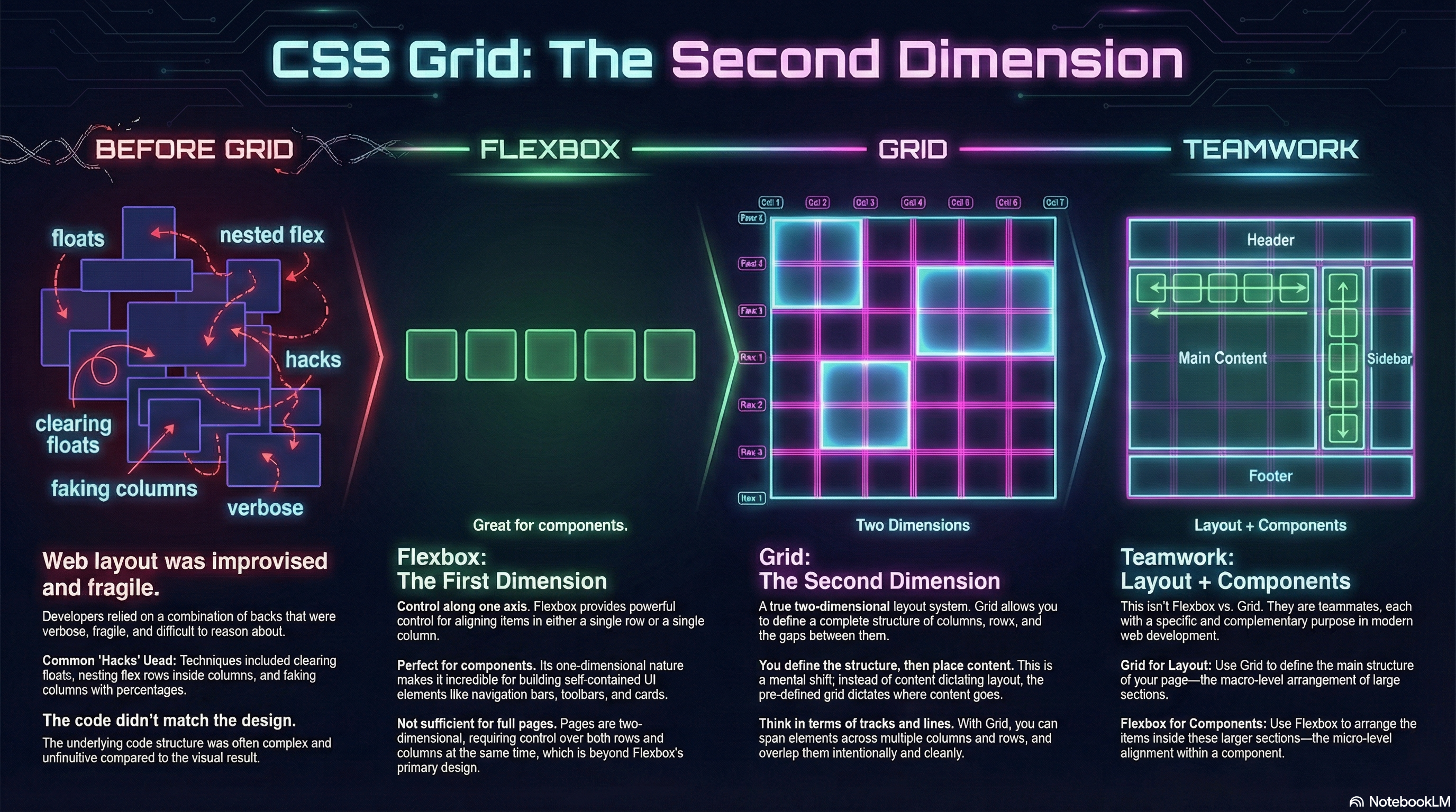
Life Before Grid
Section titled “Life Before Grid”Before Grid, full page layouts were… improvised.
We built them by:
- Nesting flex rows inside flex columns
- Clearing floats
- Faking columns with percentages
- Wrestling footers into place
- Explaining to students why the code looked nothing like the design
It worked.
But it was fragile, verbose, and exhausting to reason about.
Flexbox Was Necessary — But Not Sufficient
Section titled “Flexbox Was Necessary — But Not Sufficient”Flexbox gave us powerful control along one axis at a time.
That made it incredible for:
- Navigation bars
- Toolbars
- Cards
- Components
But pages don’t live on one axis.
They live on rows and columns simultaneously.
Enter the Second Dimension
Section titled “Enter the Second Dimension”CSS Grid is a two-dimensional layout system.
You define:
- Columns
- Rows
- Gaps
- Structure
Then you place content into that structure.
Not the other way around.
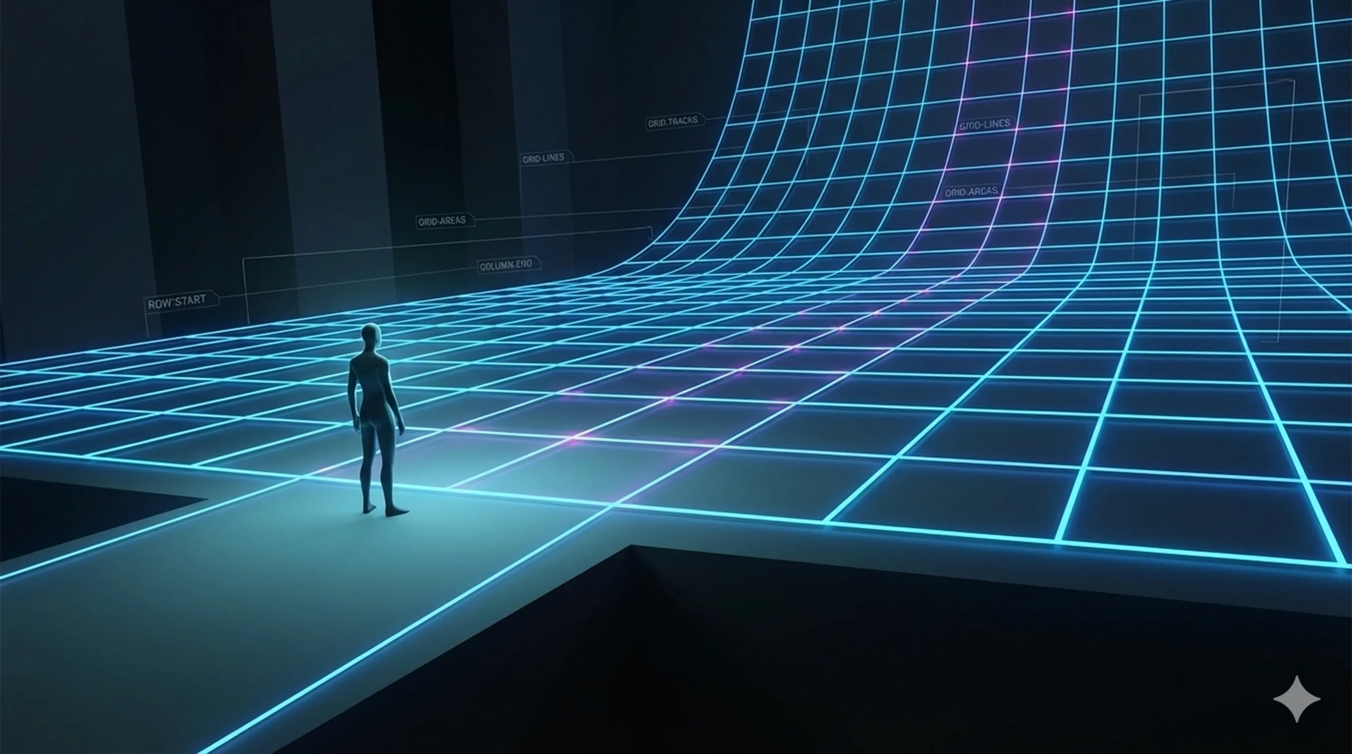
The Mental Shift
Section titled “The Mental Shift”Grid changes how you think.
You stop thinking in terms of:
- left / right
- top / bottom
And start thinking in terms of:
- grid lines
- tracks
- areas
You design the layout first.
Then you assign content to it.
That’s the second dimension.
What Grid Makes Possible
Section titled “What Grid Makes Possible”With Grid, you can:
- Build full-page layouts cleanly
- Span elements across rows and columns
- Rearrange layouts visually without touching HTML
- Redefine structure at breakpoints
- Layer and overlap elements intentionally
No floats.
No hacks.
No duct tape.
Grid and Flexbox Are Teammates
Section titled “Grid and Flexbox Are Teammates”This isn’t Flexbox vs Grid.
It’s:
- Grid for layout
- Flexbox for components
When you use both intentionally, layout becomes predictable, expressive, and sane.
And that’s where the real fun starts.
🧱 Grid: The Second Dimension Demo Lab — Coming Soon
Section titled “🧱 Grid: The Second Dimension Demo Lab — Coming Soon”Every demonstration used in this module — explicit tracks, implicit flow, line placement, template areas, responsive rewrites, and layering — will live inside the Grid: The Second Dimension Demo Lab.
Open Grid: The Second Dimension Demo Repo
Clone locally to explore the architect’s workshop (soon)
Section titled “Clone locally to explore the architect’s workshop (soon)”git clone https://github.com/ProfessorSolo/WebDevTnT-Enter-The-Grid.gitExperiment freely — redraw tracks, reassign areas, collapse layouts, and watch the structure adapt.
Grid rewards planning.
🎥 Watch the Grid Lesson
Section titled “🎥 Watch the Grid Lesson”Seeing structure reshape at breakpoints — without touching HTML — is where Grid clicks.
Watch Byte-Sized CSS Grid on Youtube
Long-form Grid Explainer on YouTube - coming soon
Extra Bits & Bytes
Section titled “Extra Bits & Bytes”📘 CSS Grid: The Second Dimension - Study Guide (PDF)
📘 CSS Grid: The Second Dimension - Infographic (PNG)