Grid Containers & Items
The Contract That Makes Grid Work
Section titled “The Contract That Makes Grid Work”Grid is powerful — but it is also strict.
Nothing happens until the parent–child relationship is established.
The Grid Container
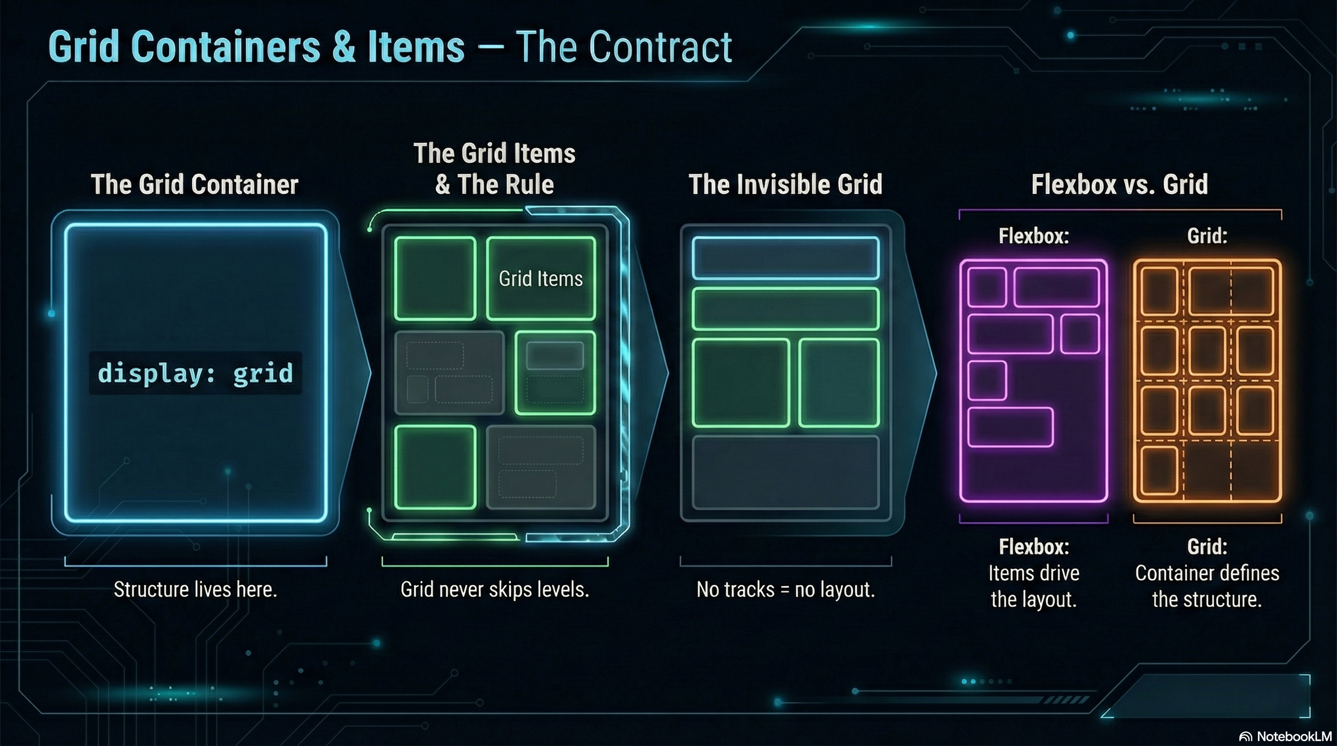
Section titled “The Grid Container”A grid layout begins the moment you declare a container:
.layout { display: grid;}That single line does two things:
- It turns the element into a grid container
- It gives its direct children the potential to become grid items
Unlike Flexbox, Grid does nothing visible yet.
No columns.
No rows.
No layout.
Just intent.
Grid Items
Section titled “Grid Items”Only direct children of a grid container participate in the grid.
<main class="layout"> <article>Grid Item</article> <article>Grid Item</article> <article>Grid Item</article></main>- Each
<article>is a grid item - Nested elements inside them are not grid items
- Grid never skips levels
This rule is absolute — and essential.
Parent Drives Layout
Section titled “Parent Drives Layout”In Grid, the container defines structure.
The items respond.
You do not:
- Size grid items directly to form layout
- Push items around with margins and positioning
- Let content decide the page structure
Instead, you:
- Define rows and columns on the container
- Then place items into that structure
Grid is layout-first CSS.
A Key Difference from Flexbox
Section titled “A Key Difference from Flexbox”Flexbox reacts to content.
Grid imposes structure.
Flexbox asks:
“How should these items flow?”
Grid asks:
“What does the layout look like?”
That distinction will guide every decision you make.
🧪 MiniMo — The Invisible Grid
Section titled “🧪 MiniMo — The Invisible Grid”Same HTML structure, same children.
One new rule — display: grid; —
…and basically nothing changes.
Grid stays invisible until we define tracks.
That’s not a bug — it’s the design.
Nothing Happens Until We Define Tracks
Section titled “Nothing Happens Until We Define Tracks”This often surprises people:
.layout { display: grid;}Produces… nothing.
Why?
Because Grid requires tracks:
- Columns
- Rows
- Or both
Until those exist, the browser has no layout to apply.
That’s not a bug.
That’s design.
The Takeaway
Section titled “The Takeaway”Before anything else in Grid:
- Define the container
- Understand the parent–child boundary
- Accept that layout lives on the parent
Everything else builds on this contract.
Break it, and Grid won’t negotiate.
Extra Bits & Bytes
Section titled “Extra Bits & Bytes”📘 Grid Containers and Items Study Guide (PDF)
📘 Grid Containers and Items Infographic (PNG)
⏭ Next in line: Grid Template Columns & Rows
Section titled “⏭ Next in line: Grid Template Columns & Rows”Let’s lay down some tracks.