Grid Template Columns & Rows
The Moment Grid Becomes Visible
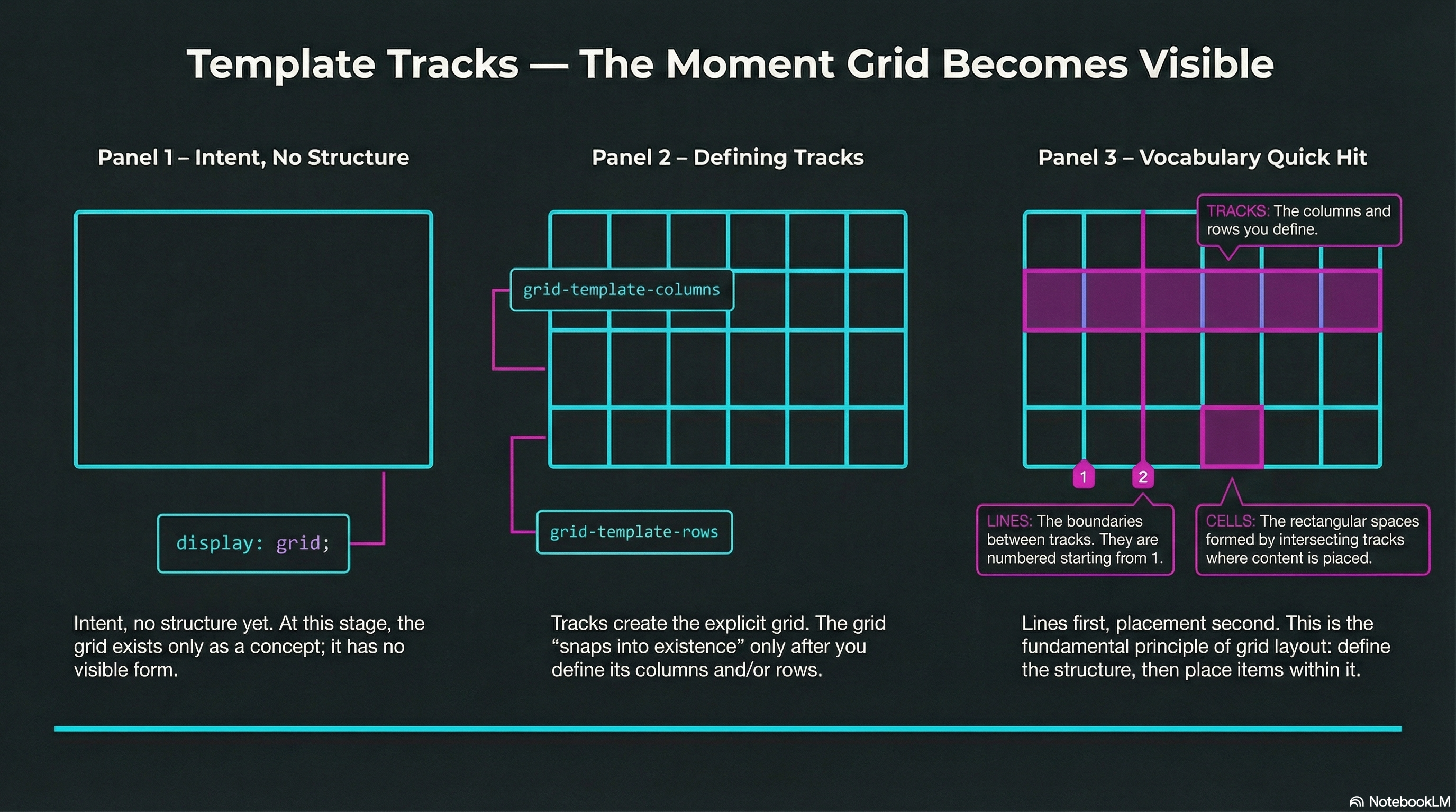
Section titled “The Moment Grid Becomes Visible”On the last page, display: grid; was pure intent.
This is where Grid finally shows up.
When you define tracks (columns and/or rows), you create the explicit grid — and the browser has a structure to apply.
Define Columns with grid-template-columns
Section titled “Define Columns with grid-template-columns”You can specify as many columns as you want, using any valid length units:
.layout { display: grid; grid-template-columns: 240px 240px 240px 240px;}Once columns exist, grid items begin flowing into the cells automatically — left to right, top to bottom.
Define Rows with grid-template-rows
Section titled “Define Rows with grid-template-rows”Rows work the same way:
.layout { display: grid; grid-template-columns: 1fr 1fr 1fr 1fr; grid-template-rows: 10rem 10rem;}If you define fewer rows than you have items for, Grid will create more rows as needed (that’s the implicit grid, coming soon).
Tracks, Lines, Cells (Quick Vocabulary)
Section titled “Tracks, Lines, Cells (Quick Vocabulary)”- Tracks: the columns and rows you define
- Lines: the boundaries between tracks (they start at 1, not 0)
- Cells: the rectangles formed by intersecting tracks
Grid is basically: lines first, placement second.
🧪 MiniMo — Make the Grid Appear
Section titled “🧪 MiniMo — Make the Grid Appear”Same HTML. New rules.
Define tracks — and the grid snaps into existence.
The Takeaway
Section titled “The Takeaway”If you want Grid to do something:
- Set the container:
display: grid; - Define tracks:
grid-template-columnsand/orgrid-template-rows
No tracks, no grid.
Extra Bits & Bytes
Section titled “Extra Bits & Bytes”📘 Grid Template Columns and Rows Study Guide (PDF)
📘 Grid Template Columns and Rows Infographic (PNG)
⏭ Next division: Fractional Units: fr
Section titled “⏭ Next division: Fractional Units: fr”Clean, smart, proportional division of available space.