The Implicit Grid
The Grid You Didn’t Ask For
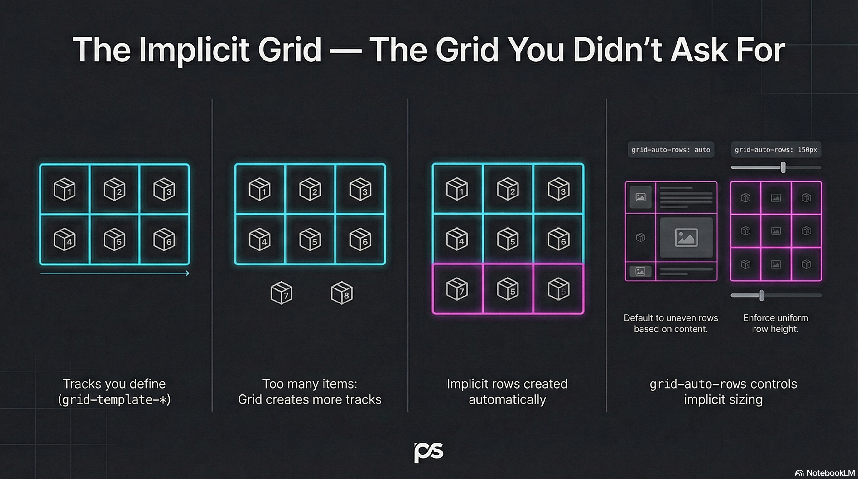
Section titled “The Grid You Didn’t Ask For”You define an explicit grid.
Then you add more items than it can hold.
Grid doesn’t panic — it quietly creates more grid.
That extra structure is the implicit grid.
Explicit vs Implicit
Section titled “Explicit vs Implicit”- Explicit grid: tracks you define with
grid-template-* - Implicit grid: tracks created automatically when items overflow
Example:
- You define 3 columns
- You place 12 items
- Grid creates as many rows as needed to fit them
Auto-Placement: The Default Flow
Section titled “Auto-Placement: The Default Flow”If you don’t place items manually, Grid auto-places them:
- left to right
- then wraps to the next row
That’s why it feels like “a smarter inline-block system”.
Control Implicit Track Sizing
Section titled “Control Implicit Track Sizing”By default, implicit rows are auto height.
You can control this using grid-auto-rows:
.layout { display: grid; grid-template-columns: repeat(3, 1fr); grid-auto-rows: 10rem;}Now every implicit row gets a consistent height.
Implicit Columns Exist Too
Section titled “Implicit Columns Exist Too”If your auto-placement flow is column-based, Grid can create implicit columns as well.
We’ll keep that one holstered for later, but it’s the same idea:
grid-auto-columns.
🧪 MiniMo — Overflow Summons the Implicit Grid
Section titled “🧪 MiniMo — Overflow Summons the Implicit Grid”Define a small explicit grid.
Add too many items.
Watch the implicit grid appear.
The Takeaway
Section titled “The Takeaway”Grid always has two layers:
- The structure you define
- The structure it creates
Learn both, and auto-placement stops being “mysterious”.
Extra Bits & Bytes
Section titled “Extra Bits & Bytes”📘 Implicit Grid Study Guide (PDF)
📘 Implicit Grid Infographic (PNG)
⏭ Flow Forward: Auto Flow & Density
Section titled “⏭ Flow Forward: Auto Flow & Density”Which direction will the grid overflow, and how?