Placement: Lines, Span & Negative Lines
Manual Placement Begins
Section titled “Manual Placement Begins”Auto-placement is polite.
This is where you stop being polite.
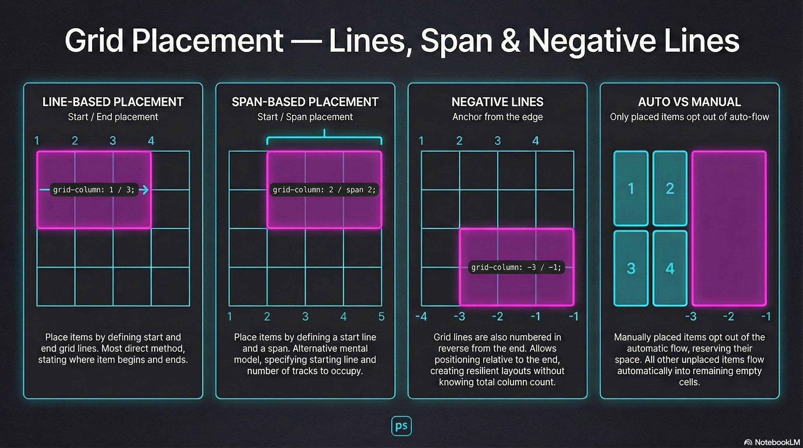
Grid placement is line-based:
- Lines start at 1
- You choose start / end or start / span
- Anything not placed stays in auto-flow
Two Placement Styles
Section titled “Two Placement Styles”Start / End (Line-Based)
Section titled “Start / End (Line-Based)”grid-column: 1 / 3;grid-row: 2 / 4;Start / Span (Distance-Based)
Section titled “Start / Span (Distance-Based)”grid-column: 2 / span 2;grid-row: 1 / span 3;Same power. Different mental model.
Negative Lines: Anchoring from the Edge
Section titled “Negative Lines: Anchoring from the Edge”Grid lines also count backward.
-1→ last line-2→ second-to-last
grid-column: -3 / -1;You don’t need to know how many columns exist.
You just aim for the edge.
🧪 MiniMo — Placement Console
Section titled “🧪 MiniMo — Placement Console”The Takeaway
Section titled “The Takeaway”Auto-placement is convenience.
Placement is intent.
Negative lines make that intent resilient.
Extra Bits & Bytes
Section titled “Extra Bits & Bytes”📘 Grid Lines & Spans Study Guide (PDF)
📘 Grid Lines & Spans Infographic (PNG)
⏭ Next Room: Grid Template Areas
Section titled “⏭ Next Room: Grid Template Areas”Named spaces are easier to work with than edge lines.