Alignment & Gaps
Space Is a First-Class Citizen
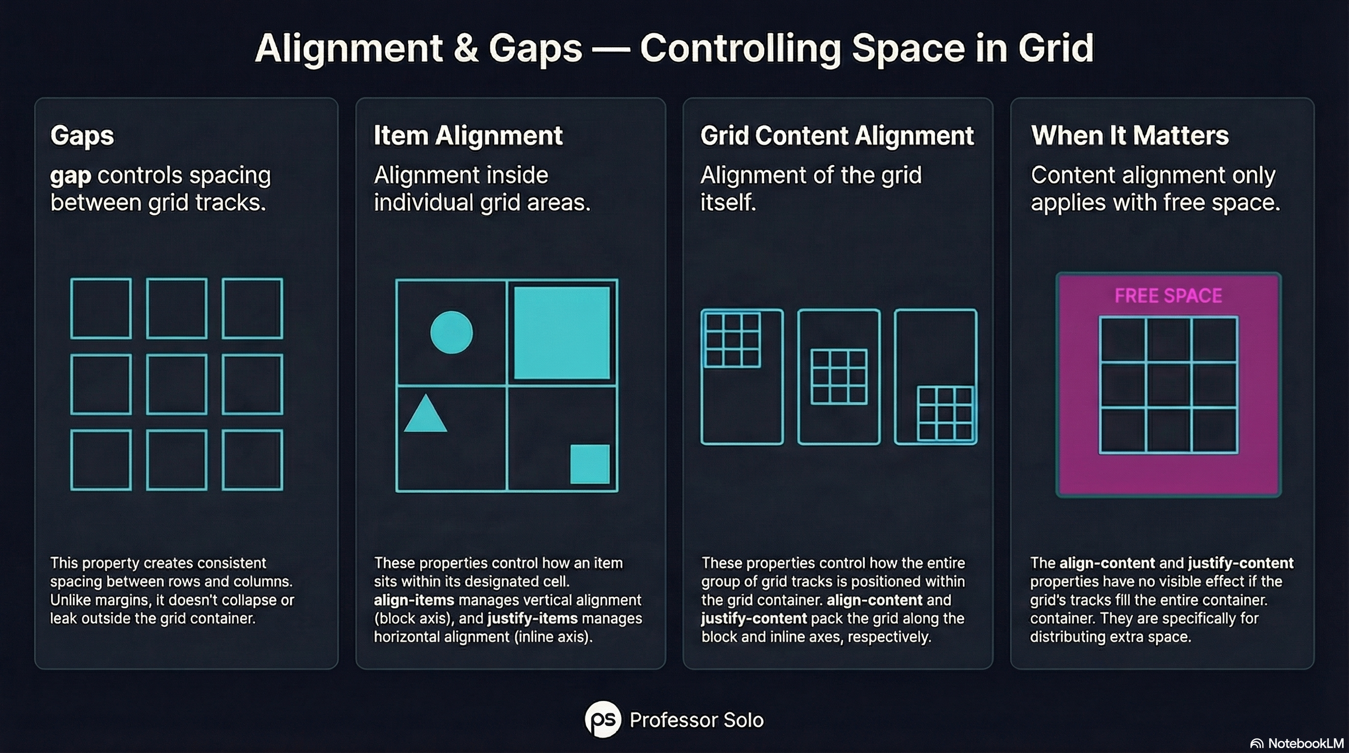
Section titled “Space Is a First-Class Citizen”Grid doesn’t just place items — it manages space.
There are two different alignment stories:
- how items align inside their cells
- how the grid aligns inside its container
And one universal spacer: gap.
Gaps Are Not Margins
Section titled “Gaps Are Not Margins”grid-template-columns: repeat(4, 1fr);gap: 1rem;gap:
- works in both directions
- doesn’t collapse
- doesn’t leak outside the grid
Use it. Love it.
Aligning Items (Inside Cells)
Section titled “Aligning Items (Inside Cells)”These affect how items sit within their grid areas:
align-items(block axis)justify-items(inline axis)
align-items: center;justify-items: stretch;Aligning the Grid Itself
Section titled “Aligning the Grid Itself”These affect how the entire grid is packed inside the container:
align-contentjustify-content
They only matter when there’s extra space.
🧪 MiniMo — Alignment Lab
Section titled “🧪 MiniMo — Alignment Lab”Change gaps.
Shift items.
Watch space move.
The Takeaway
Section titled “The Takeaway”Grid gives you control over:
- placement
- spacing
- alignment
Once you see the difference, the properties stop feeling redundant.
Extra Bits & Bytes
Section titled “Extra Bits & Bytes”📘 Alignment and Gaps Study Guide (PDF)
📘 Alignment and Gaps Infographic (PNG)
⏭ Move Inside: Nested Grids
Section titled “⏭ Move Inside: Nested Grids”Pages, sections, components. Grids inside grids inside grids.