Nested Grids
Grid All the Way Down
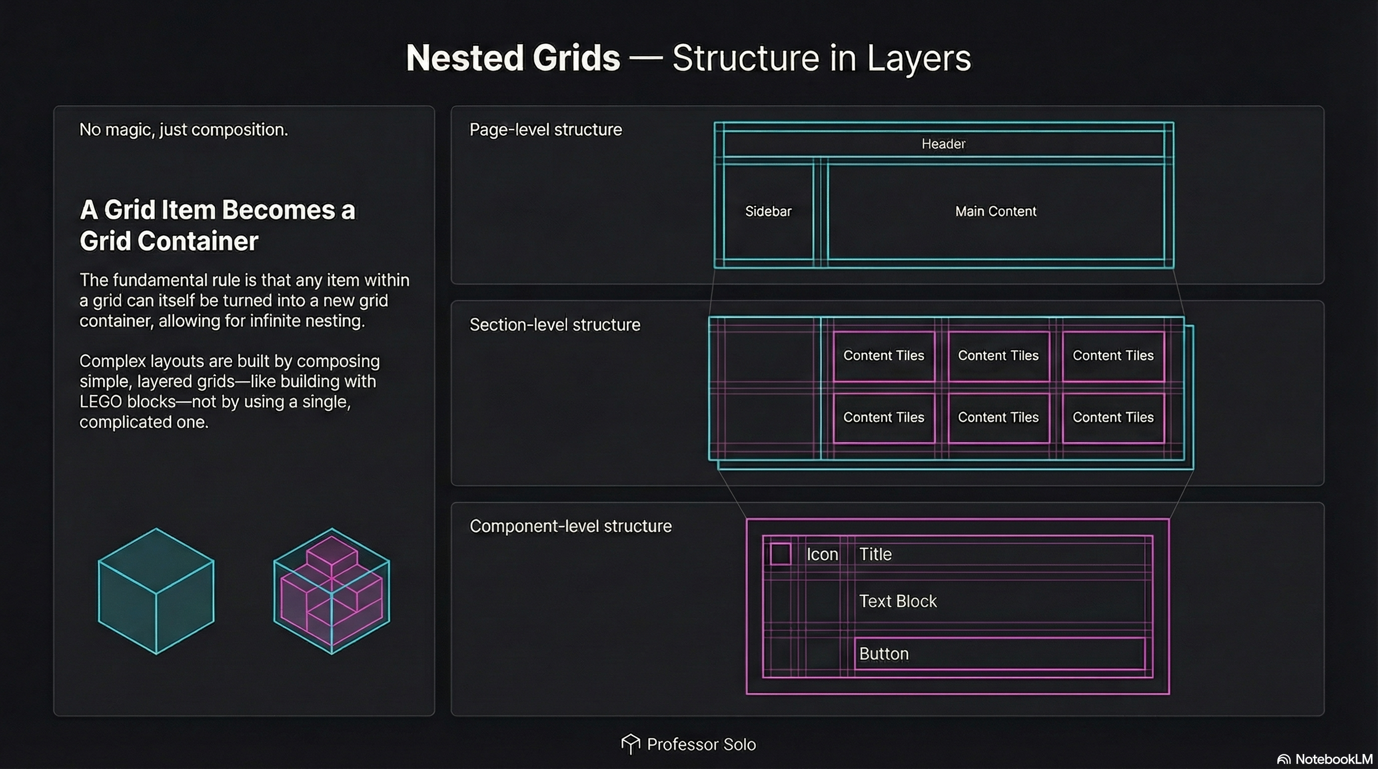
Section titled “Grid All the Way Down”Real layouts aren’t one grid.
They’re layers of grids:
- page-level grid (header / sidebar / content)
- section-level grid (cards, tiles, galleries)
- component grid (icon + text + actions)
The rule is simple:
A grid item can also be a grid container.
The Pattern
Section titled “The Pattern”Outer grid defines the big structure.
Inner grid defines the structure inside a region.
.page {  display: grid;  grid-template-columns: 14rem 1fr;  grid-template-areas:    'header  header'    'sidebar content';}
.content {  grid-area: content;  display: grid; /* nested grid */  grid-template-columns: repeat(3, 1fr);  gap: 1rem;}
No magic.
Just composition.
Common Student Mistake
Section titled “Common Student Mistake”They try to make one grid do everything.
That’s how you get:
- unreadable templates
- brittle placement rules
- layouts that explode on resize
Nested grids keep each layer clean.
🧪 MiniMo — Nested Grid Switchboard
Section titled “🧪 MiniMo — Nested Grid Switchboard”Turn the nested grid on/off.
Change inner columns.
Watch the outer layout stay stable.
The Takeaway
Section titled “The Takeaway”Grid is a system, not a single layout.
Build big structure first.
Then grid the inside.
Extra Bits & Bytes
Section titled “Extra Bits & Bytes”📘 Nested Grid Study Guide (PDF)
📘 Nested Grid Infographic (PNG)
⏭ Stack Time: Layering & Overlap
Section titled “⏭ Stack Time: Layering & Overlap”Welcoming the Z-Index to the Grid.