Layering & Overlap
Grid Has a Z‑Axis
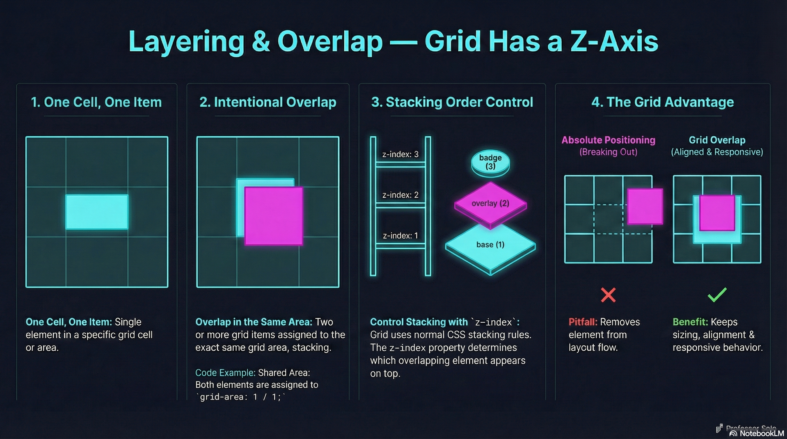
Section titled “Grid Has a Z‑Axis”Most people think Grid is rows and columns.
It’s also layers.
Multiple grid items can occupy the same cells — and that’s not a mistake.
That’s how you build:
- hero overlays
- badges
- callouts
- stacked UI panels
The Core Idea
Section titled “The Core Idea”Two or more items can share the same grid area.
.hero {  display: grid;}
.hero img {  grid-area: 1 / 1;}
.hero .overlay {  grid-area: 1 / 1;}
Same cells. Different layers.
Controlling the Stack
Section titled “Controlling the Stack”Grid doesn’t invent stacking rules — it uses normal CSS stacking.
.overlay { z-index: 2;}Positioning is optional.
Grid items stack naturally when they overlap.
Common Pitfall
Section titled “Common Pitfall”Students reach for position: absolute.
That works — but you lose:
- intrinsic sizing
- grid alignment
- responsive flow
Grid overlap keeps everything in the layout system.
🧪 MiniMo — Overlap Playground
Section titled “🧪 MiniMo — Overlap Playground”Toggle overlap.
Raise layers.
See how grid stays intact.
The Takeaway
Section titled “The Takeaway”Grid isn’t just structure.
It’s controlled chaos — with rules.
Extra Bits & Bytes
Section titled “Extra Bits & Bytes”📘 Layering Items Study Guide (PDF)
📘 Layering Items Infographic (PNG)
⏭ Together at Last: Grid & Flexbox Unite
Section titled “⏭ Together at Last: Grid & Flexbox Unite”It’s not a competition. Grid and Flex work together.