Grid vs Flexbox
The Architect’s Jam
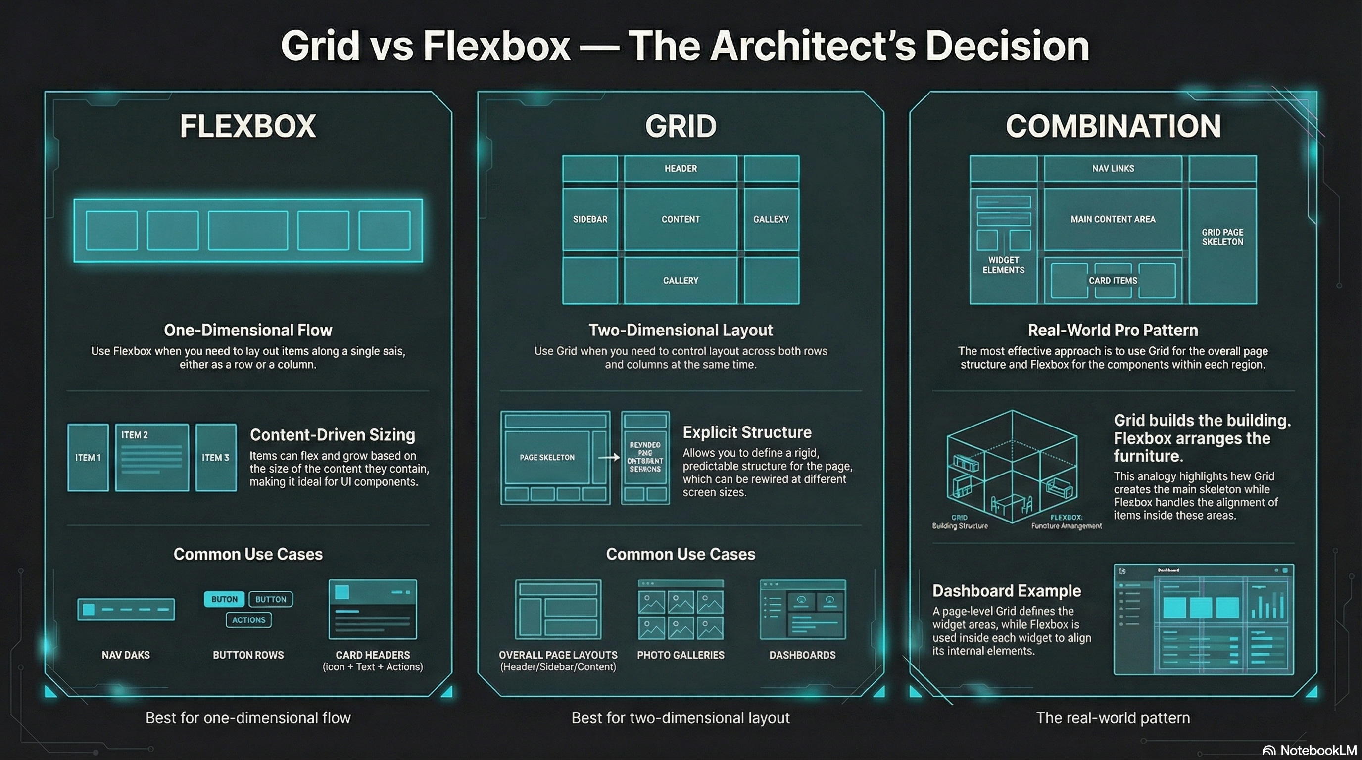
Section titled “The Architect’s Jam”Flexbox and Grid are not rivals.
They’re specialists.
- Flexbox: one-dimensional flow (row or column)
- Grid: two-dimensional layout (rows and columns)
If you pick the right tool, your CSS gets smaller.
If you pick the wrong one, you start wrestling the browser… and losing.
The Quick Rule
Section titled “The Quick Rule”Use Flexbox when…
Section titled “Use Flexbox when…”- you’re laying out items along one axis
- you want content-driven sizing
- you’re aligning/spacing a row of UI controls
Examples:
- nav bars
- button rows
- card headers (icon + text + actions)
- “center this thing” (yes, still)
Use Grid when…
Section titled “Use Grid when…”- you need both axes
- you want explicit structure
- you want layout that can rewire at breakpoints
Examples:
- page layouts (header / sidebar / content / footer)
- galleries, dashboards, tiles
- responsive “areas” layouts
- overlap / layering
Use Both (The Real Move)
Section titled “Use Both (The Real Move)”Common pro pattern:
- Grid for the page-level skeleton
- Flexbox for components inside each region
Grid builds the building.
Flexbox arranges the furniture.
🧪 MiniMo — Decision Console
Section titled “🧪 MiniMo — Decision Console”Pick a layout scenario.
Get the call.
See the why.
The Takeaway
Section titled “The Takeaway”You don’t “graduate” from Flexbox to Grid.
You collect tools.
Then you build better systems.
Extra Bits & Bytes
Section titled “Extra Bits & Bytes”📘 Grid and Flex Co-op Study Guide (PDF)
📘 Grid and Flex Co-op Infographic (PNG)
⏭ Building Time, Check the Matrix
Section titled “⏭ Building Time, Check the Matrix”Exercise your grid skills with some layout challenges.
Find what you’re looking for in the Matrix.