Grow, Shrink, Basis
Terms of the Space Deal
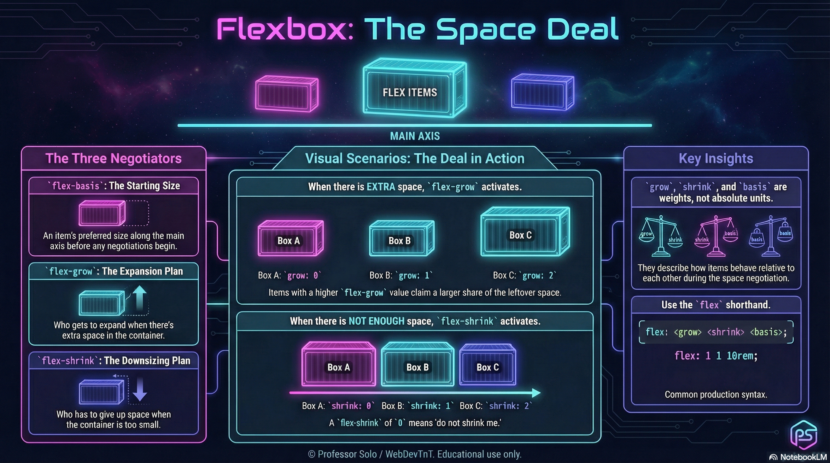
Section titled “Terms of the Space Deal”Once a container knows its direction and axes, flex items start negotiating for space.
Three numbers run the table:
flex-grow– how strongly an item asks to growflex-shrink– how willing an item is to be squishedflex-basis– the size an item wants to start at along the main axis
Together, they decide who stretches, who holds the line, and who quietly adapts.
flex-grow: Who Gets Extra Room
Section titled “flex-grow: Who Gets Extra Room”When there is extra space on the main axis, flex-grow decides who claims it.
.track {  display: flex;}
.track > .card {  flex-grow: 1; /* equal shares */}
.track > .card--hero { flex-grow: 3; /* three shares */}- All grow values are compared as weights.
1, 1, 1→ equal slices.1, 3, 1→ the middle item takes three parts for every one part the others get.
Grow only matters when there is slack to distribute.
flex-shrink: Who Refuses to Be Squished
Section titled “flex-shrink: Who Refuses to Be Squished”When there is not enough space, flex-shrink decides who gives in.
.track {  display: flex;}
.track > .card {  flex-shrink: 1; /* default: can shrink */}
.track > .card--stubborn {  flex-shrink: 0; /* holds its width as long as possible */}
Shrink is another weight:
1, 1, 1→ all items share the squeeze.0, 1, 1→ the first item resists; neighbors take more of the hit.
Shrink only matters when the container is too small.
flex-basis: Where Each Item Starts
Section titled “flex-basis: Where Each Item Starts”flex-basis sets an item’s starting size along the main axis
(before grow/shrink negotiations adjust it).
.track > .card { flex-basis: 10rem; /* start at this width in a row */}If flex-basis is set, it usually overrides width along the main axis.
In a row, basis behaves like a starting width.
In a column, basis behaves like a starting height.
The Shorthand: flex
Section titled “The Shorthand: flex”We rarely write the three properties separately in production:
.card { flex: 1 1 12rem; /* ↑ ↑ ↑ | | └─ flex-basis | └──── flex-shrink └────── flex-grow */}Some common patterns:
.card { flex: 1;} /* flex: 1 1 0 */.card--hero { flex: 2 1 12rem;} /* grows more, starts wider */.card--fixed { flex: 0 0 8rem;} /* no grow, no shrink, fixed basis */The MiniMo above walks through three classic deals:
- equal partners
- a greedy middle item
- a stubborn item that refuses to shrink
Extra Bits & Bytes
Section titled “Extra Bits & Bytes”📘 Grow, Shrink, Basis - Study Guide (PDF)
📘 Grow, Shrink, Basis - Infographic (PNG)
⏭ Where To Go: Wrap and Flow
Section titled “⏭ Where To Go: Wrap and Flow”Now that items can negotiate space:
- Wrap & Flow will show how those negotiations play out across multiple lines.