Named Areas
Blueprints, Not Coordinates
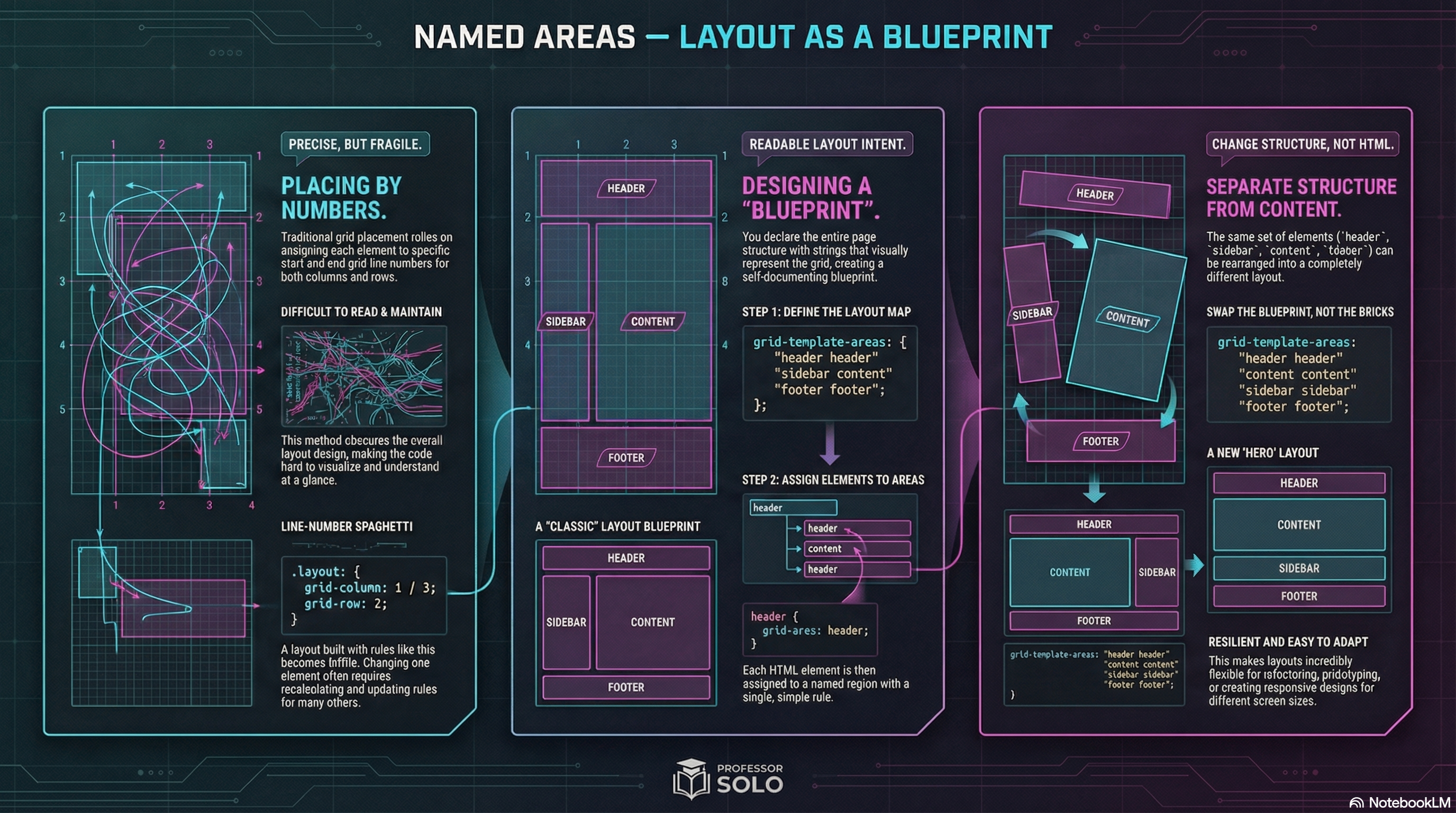
Section titled “Blueprints, Not Coordinates”Line numbers are precise.
But they can also get… gross.
Named areas let you design a layout like a map:
- header
- sidebar
- content
- footer
That’s what grid-template-areas is for: readable layout intent.
Define Areas on the Container
Section titled “Define Areas on the Container”.layout { display: grid; grid-template-columns: 14rem 1fr; grid-template-rows: auto 1fr auto;
grid-template-areas: 'header header' 'sidebar content' 'footer footer';}The strings describe the grid.
Assign Items to Areas
Section titled “Assign Items to Areas”header { grid-area: header;}aside { grid-area: sidebar;}main { grid-area: content;}footer { grid-area: footer;}Now your HTML can stay semantic, and the grid does the layout work.
Dots Mean “Empty”
Section titled “Dots Mean “Empty””You can leave cells unused with .
grid-template-areas: 'header header' '. content' 'footer footer';🧪 MiniMo — Area Architect
Section titled “🧪 MiniMo — Area Architect”Swap blueprints.
Watch the layout rewire itself.
The Takeaway
Section titled “The Takeaway”Areas are the readable option:
- great for page layout
- easy to refactor
- less fragile than line-number spaghetti
Extra Bits & Bytes
Section titled “Extra Bits & Bytes”📘 Grid Template Areas Study Guide (PDF)
📘 Grid Template Areas Infographic (PNG)
⏭ Shuffle Along: Responsive Template Areas
Section titled “⏭ Shuffle Along: Responsive Template Areas”Restructure pages responsively (and responsibility).