Responsive Areas
Same HTML. New Blueprint.
Section titled “Same HTML. New Blueprint.”Named areas are already readable.
Responsive areas are where Grid becomes unfair.
You can rebuild the entire page layout at different breakpoints without touching your HTML.
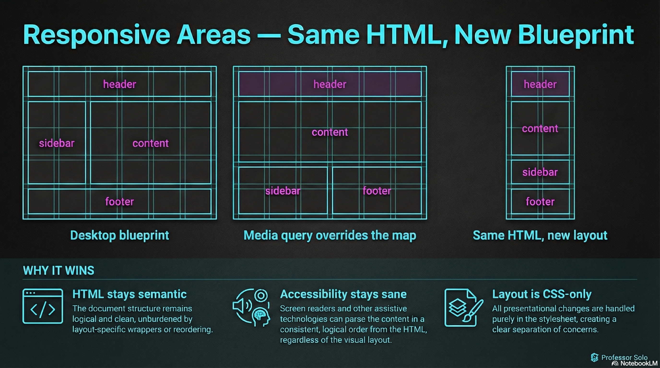
The Pattern
Section titled “The Pattern”- Define the desktop blueprint
- Override the blueprint in a media query
.layout {  display: grid;  grid-template-columns: 14rem 1fr;  grid-template-areas:    'header  header'    'sidebar content'    'footer  footer';}
@media (max-width: 48rem) {  .layout {    grid-template-columns: 1fr;    grid-template-areas:      'header'      'content'      'sidebar'      'footer';  }}
This is the secret sauce:
- same elements
- same
grid-areanames - different map
Why This Beats “Reordering the DOM”
Section titled “Why This Beats “Reordering the DOM””- Your HTML stays semantic
- Accessibility stays sane
- Layout becomes a CSS-only concern
🧪 MiniMo — Responsive Blueprint Switcher
Section titled “🧪 MiniMo — Responsive Blueprint Switcher”Toggle between desktop, tablet, and mobile blueprints.
Notice: no HTML changes.
The Takeaway
Section titled “The Takeaway”Grid areas aren’t just readable.
They’re refactorable.
That’s the difference between “layout” and “layout system.”
Extra Bits & Bytes
Section titled “Extra Bits & Bytes”📘 Responsive Grid Areas Study Guide (PDF)
📘 Responsive Grid Areas Infographic (PNG)
⏭ Up Ahead: Alignment and Spacing
Section titled “⏭ Up Ahead: Alignment and Spacing”How are items aligned within an area and how are the spaces between defined.